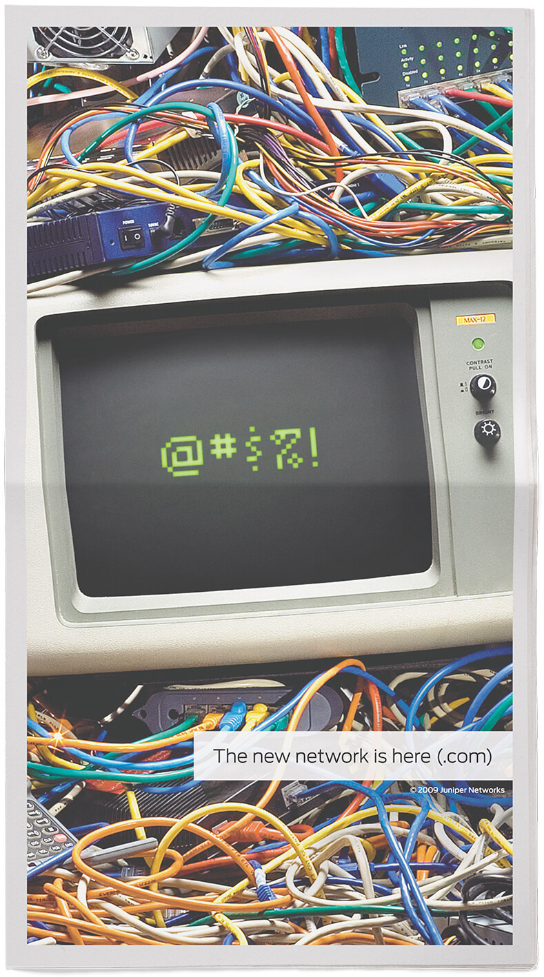
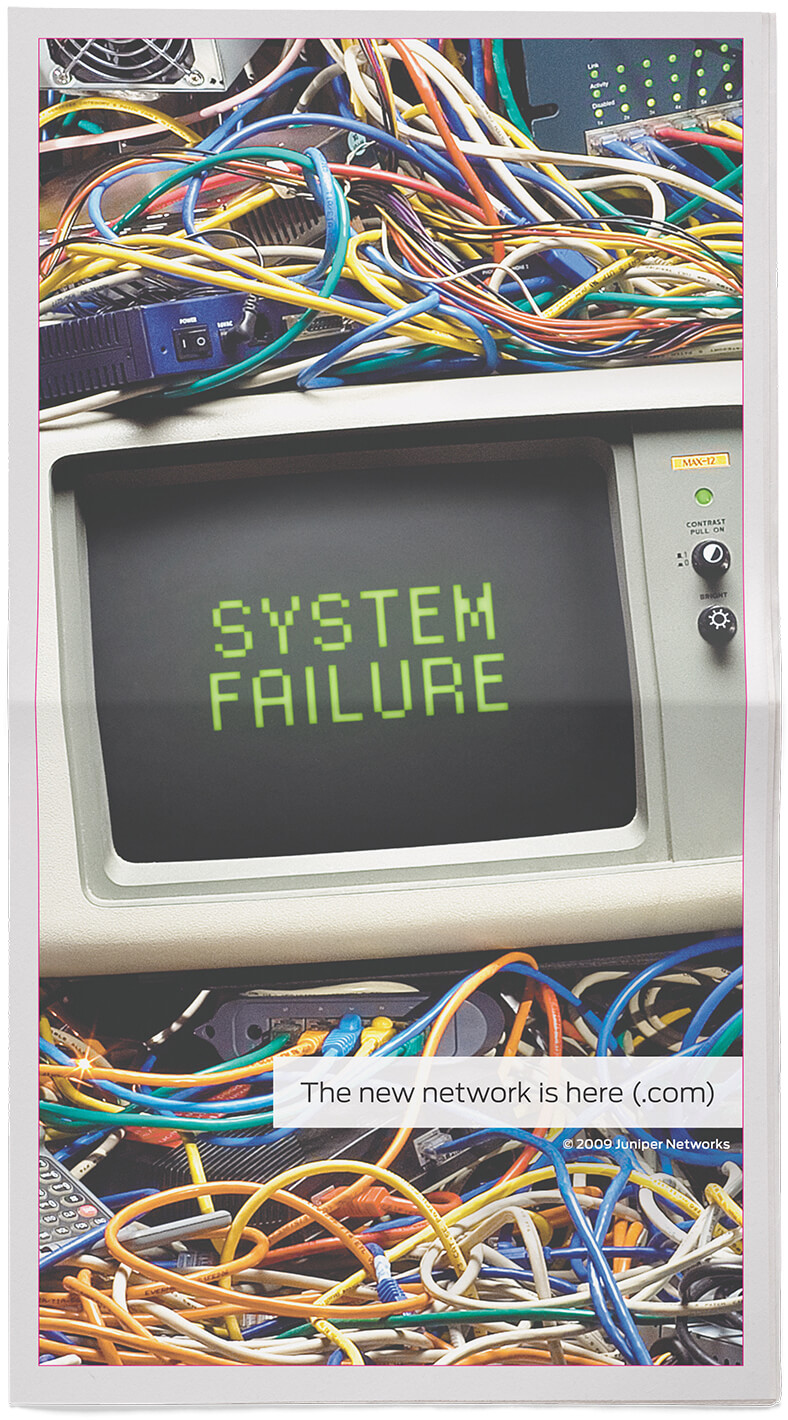
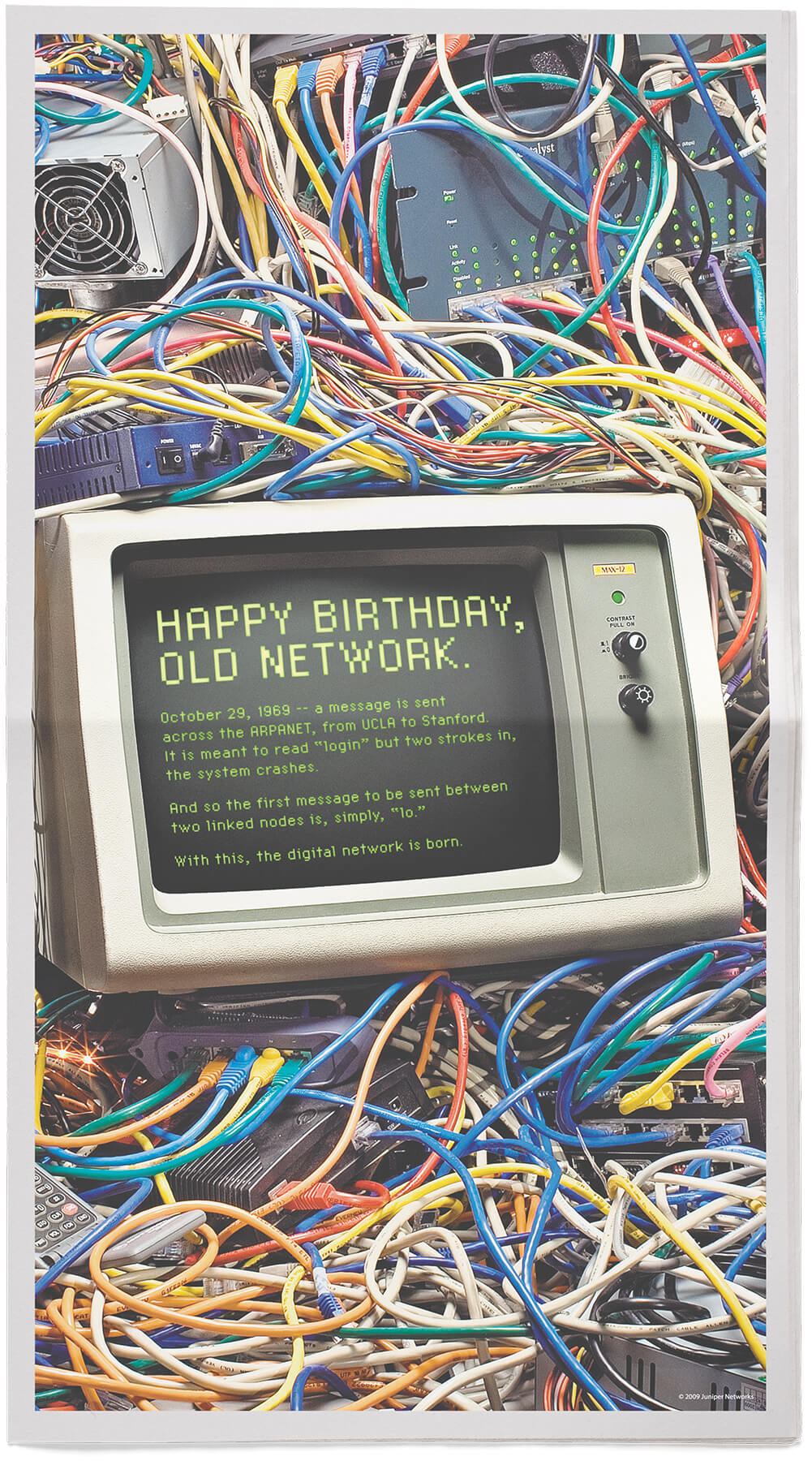
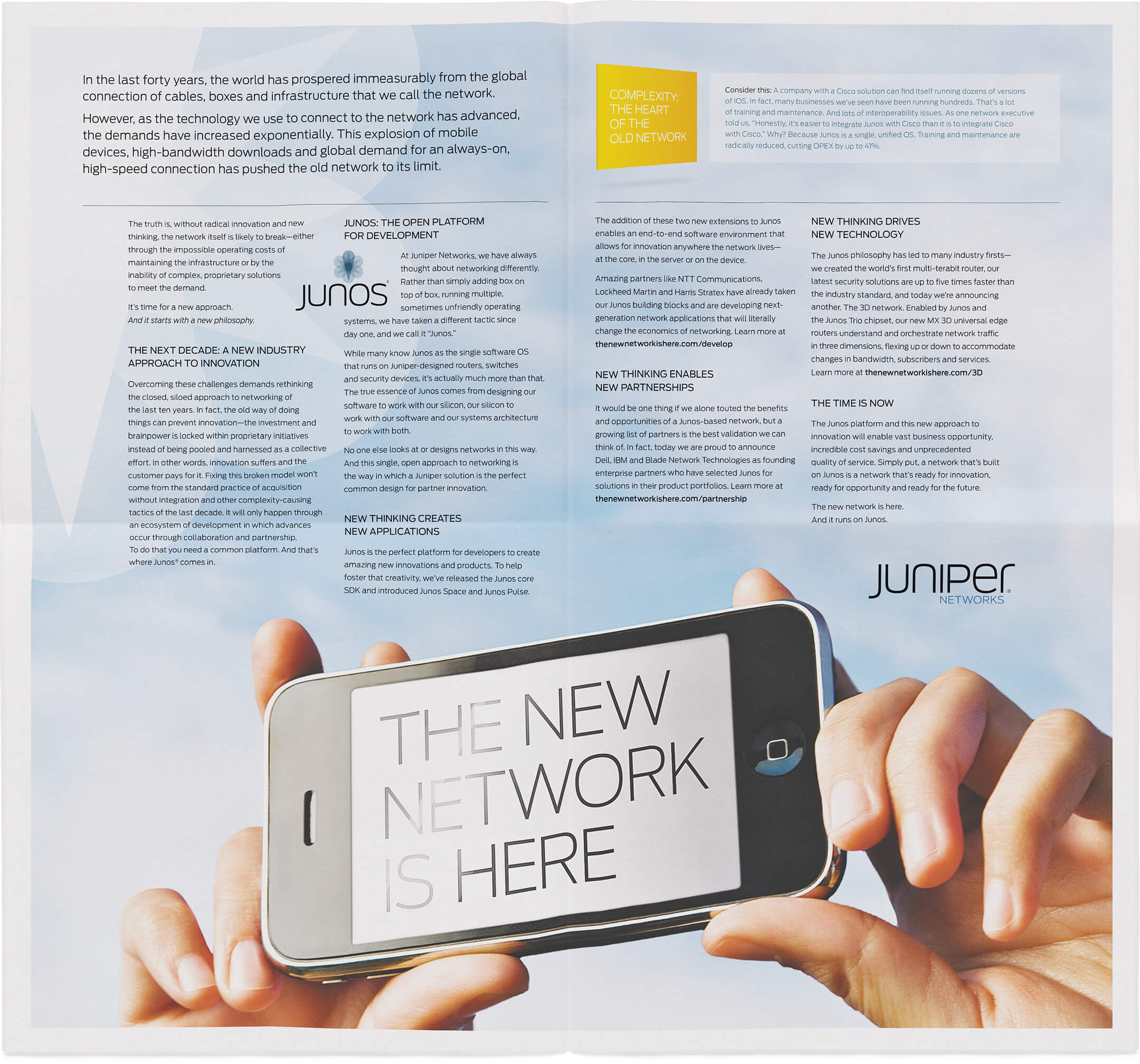
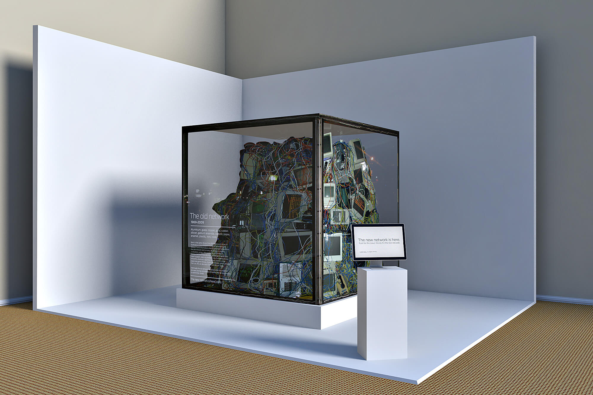
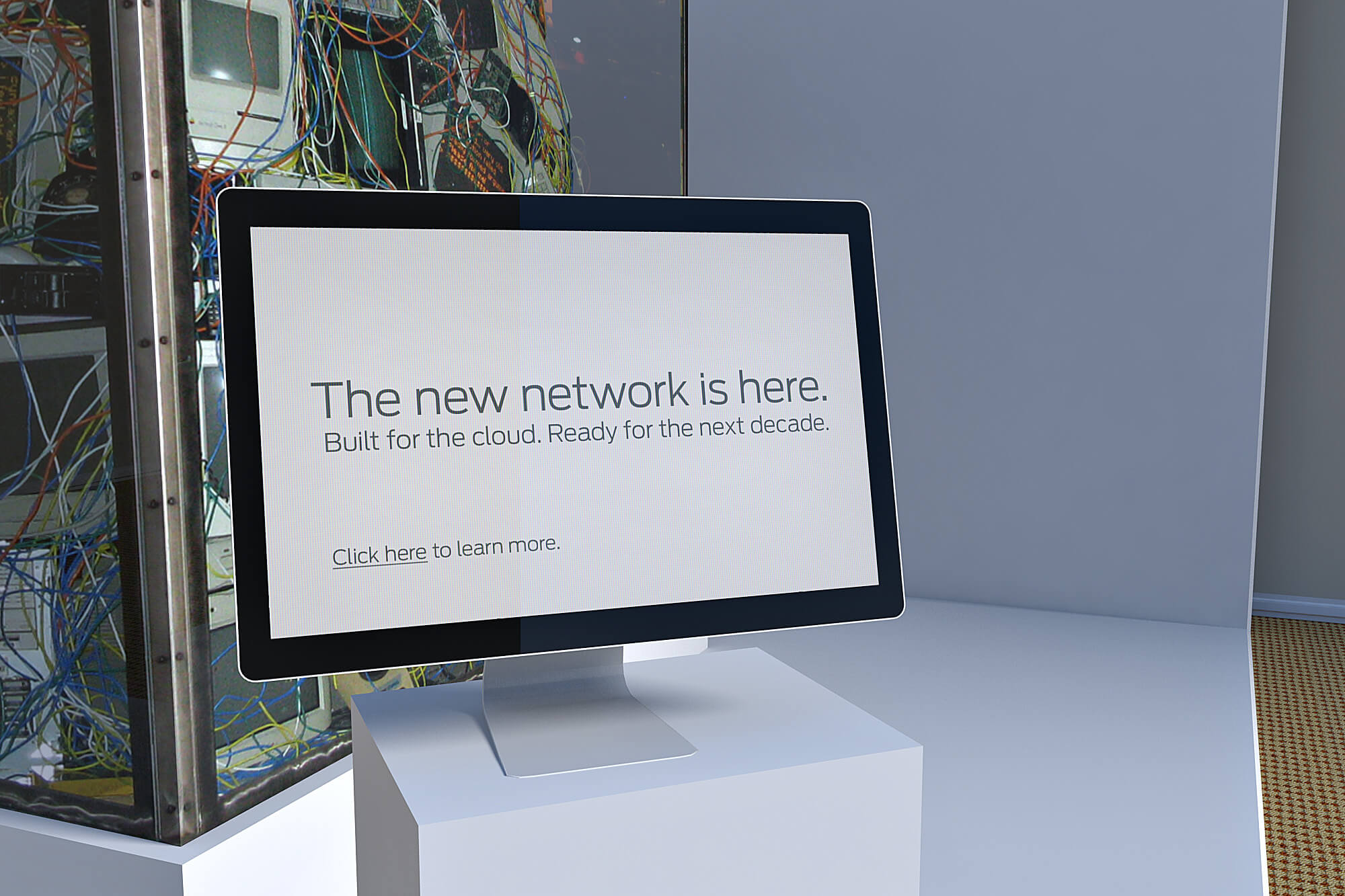
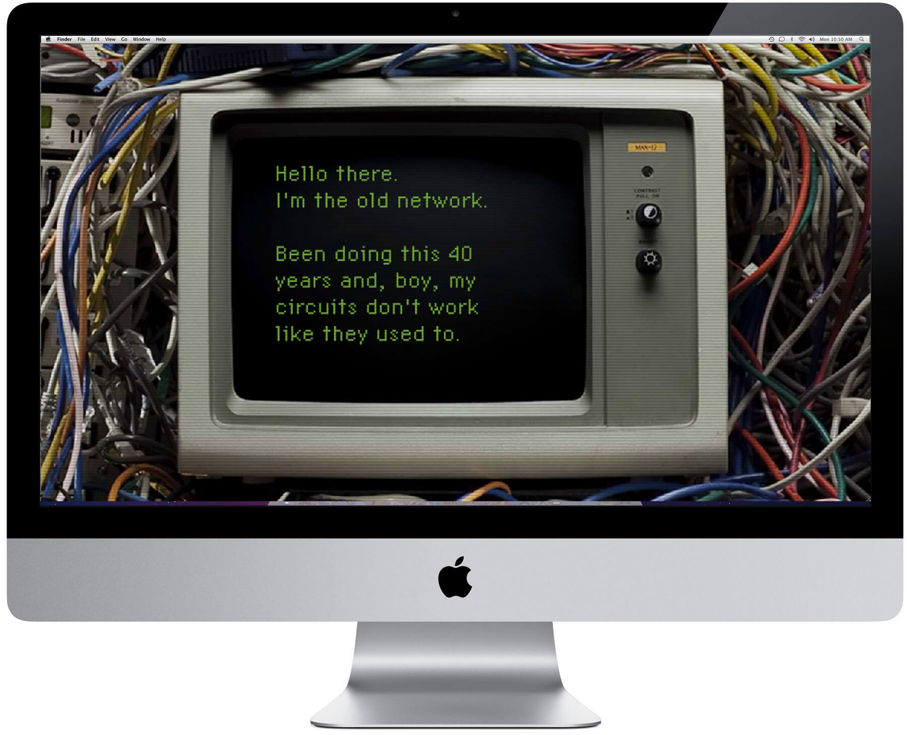
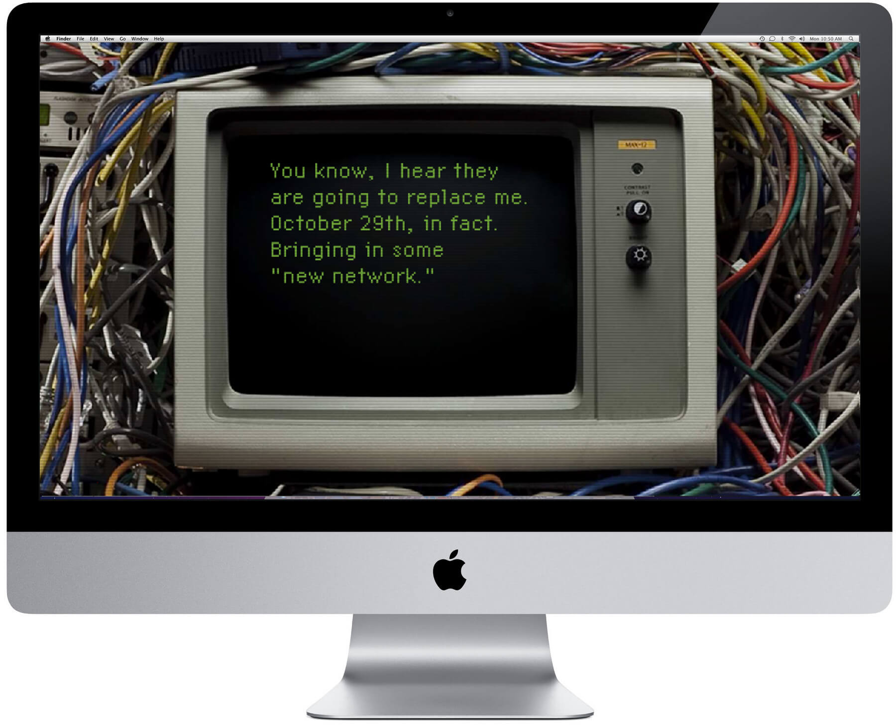
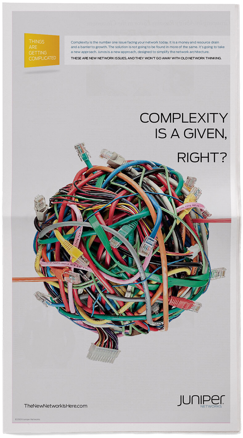
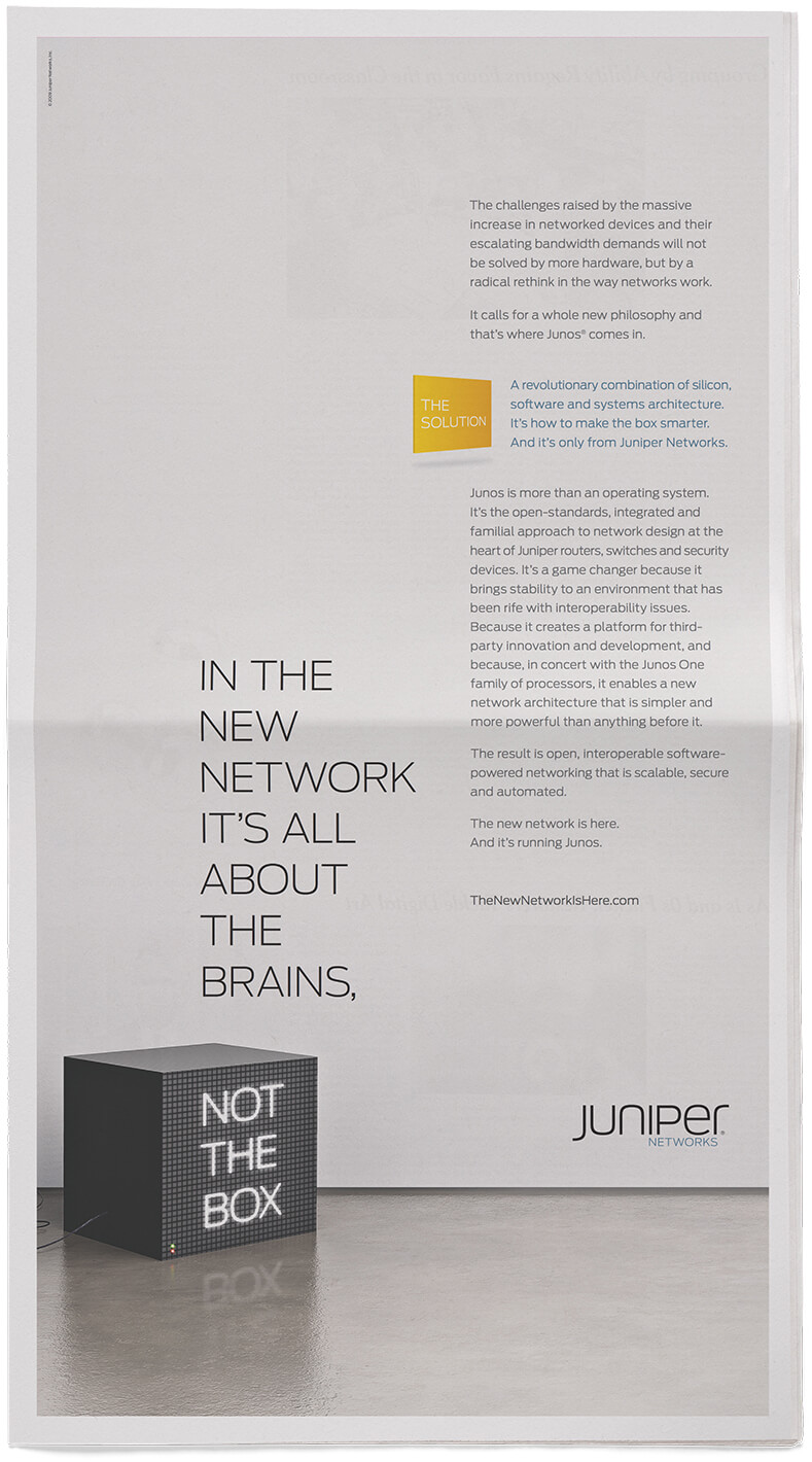
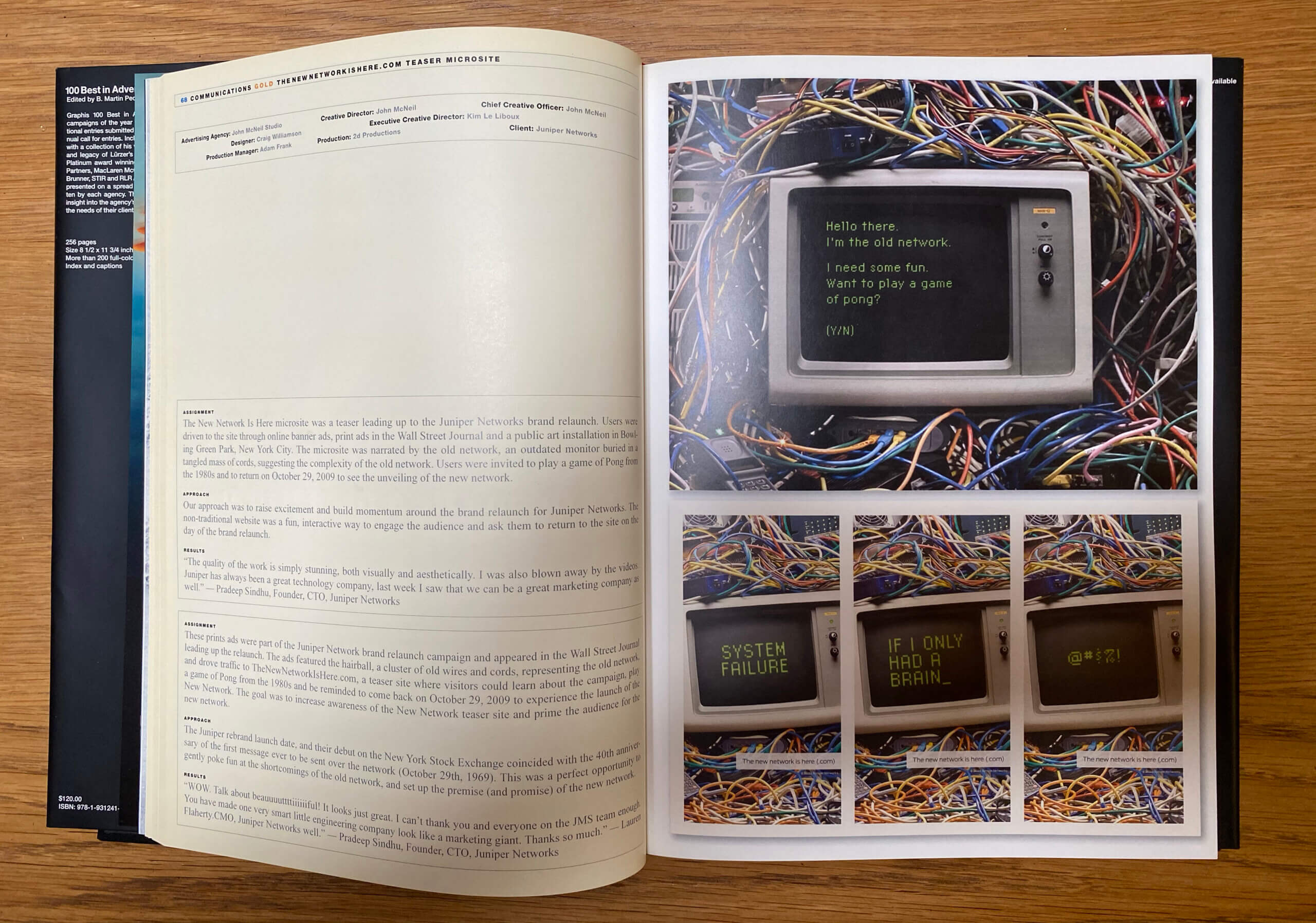
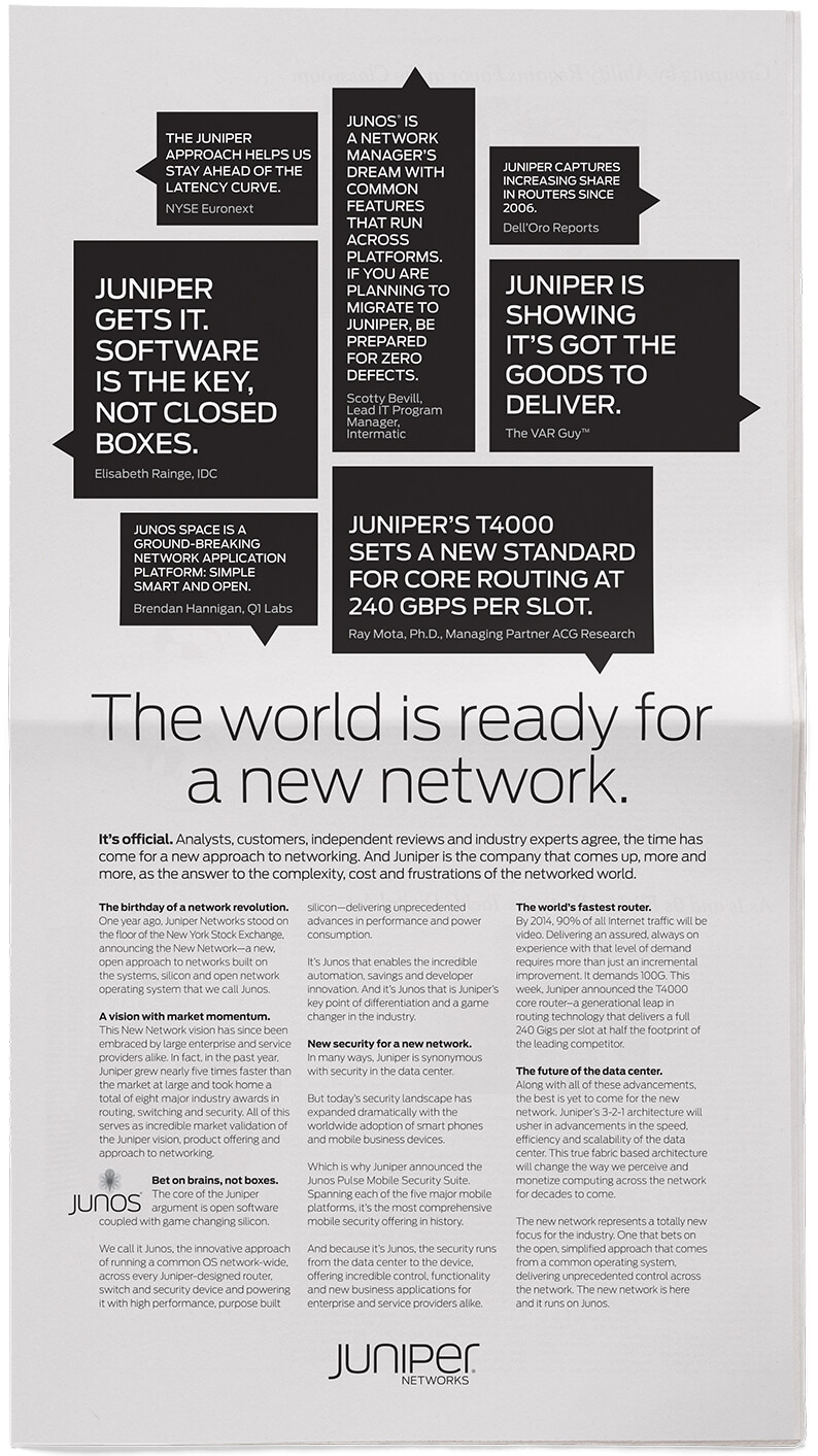
The new network On October 29th, 2009—the 40th birthday of the network itself—Juniper Networks relaunched their brand with a new identity, campaign and listing on the New York Stock Exchange. From print to web, interactive, customer stories and a rich microsite, the campaign told the powerful story of a different approach to networking; one founded on Juniper’s innovative software, silicon and systems architecture. Another innovative execution was a transparent cube set up in lower Manhattan that was filled with the remains of old computers and wiring. It again represented the old network and was more like a modern art installation than a marketing tool. Dubbed “The Hairball,” it represented antique technology and garnered plenty of buzz.

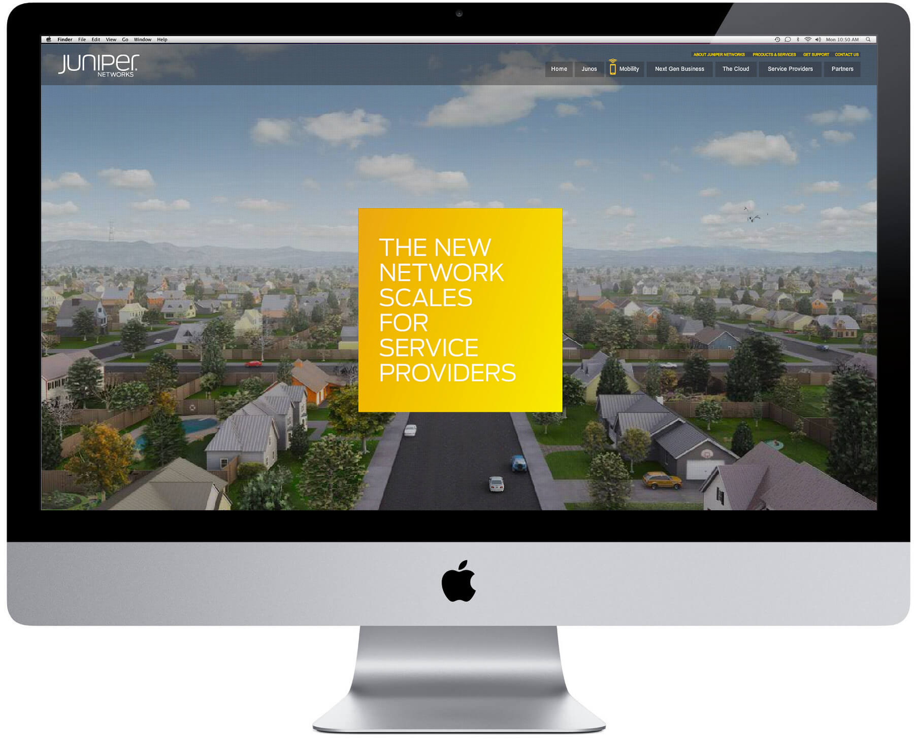
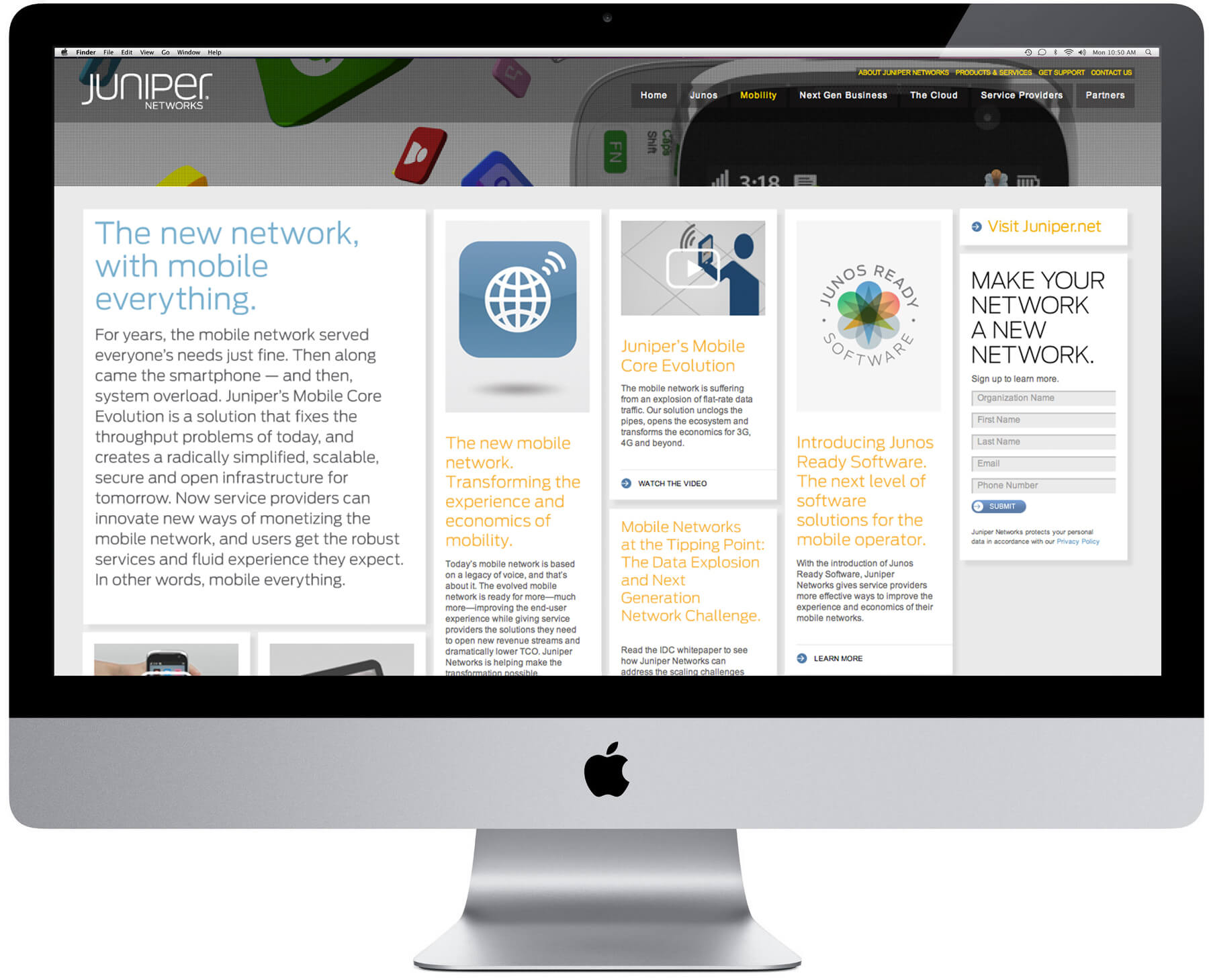


Rebrand In conducting executive interviews as part of the brand discovery process, it became clear that Juniper was investing in its Juniper operating system as part of its growth strategy. This insight led directly to a simple wordmark for the main company using a limited number of letterforms, and a modular, more graphic system for all the components of its software.


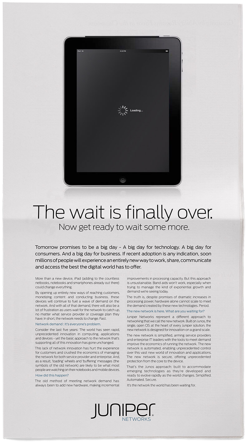
Waiting campaign With the explosion of network-enabled products launching every year, one component had not kept pace: the network itself. JMS conceived the “waiting” campaign to highlight Juniper’s fundamentally different approach, timed to coincide with the launch of the iPad and other breakthrough technologies. The campaign ran in the Wall Street Journal, Wired and Bloomberg Business Week.
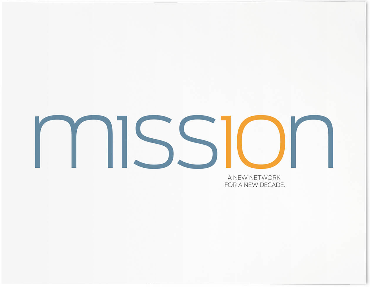
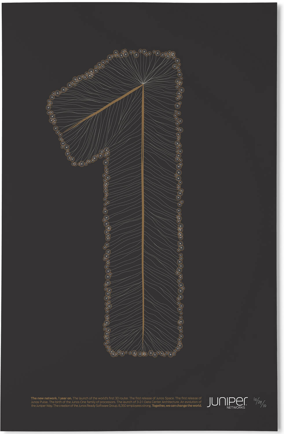
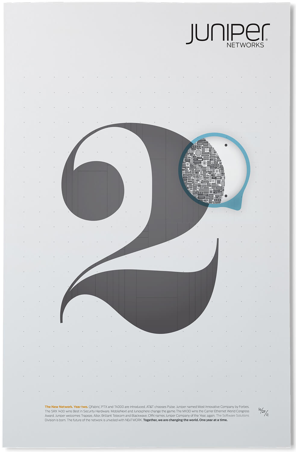
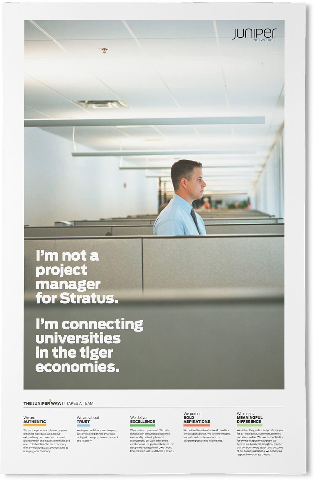
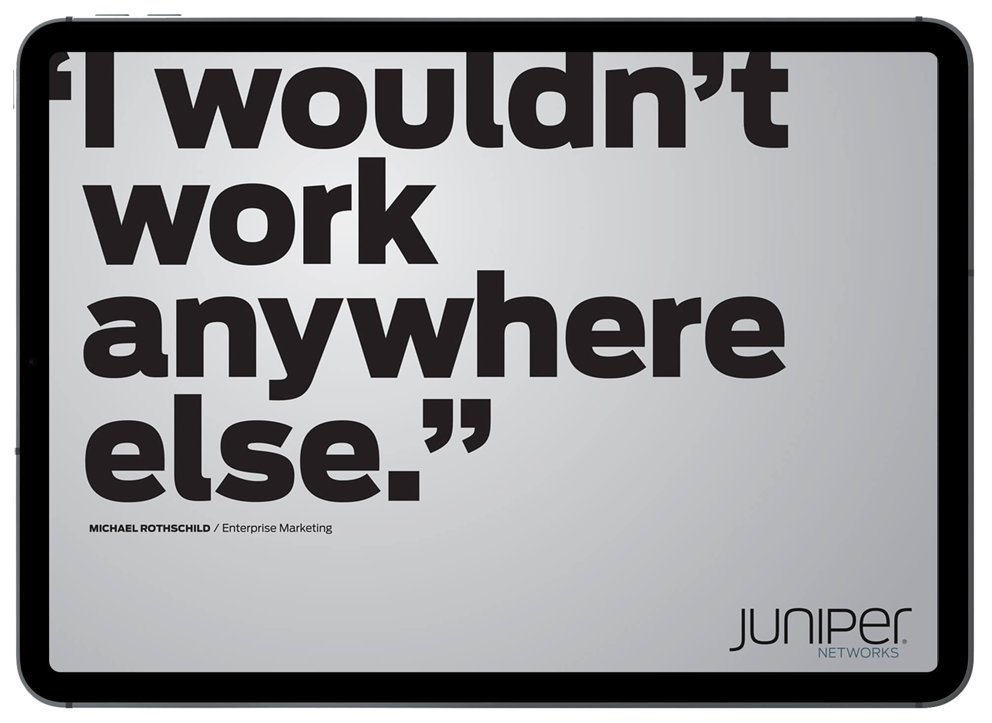
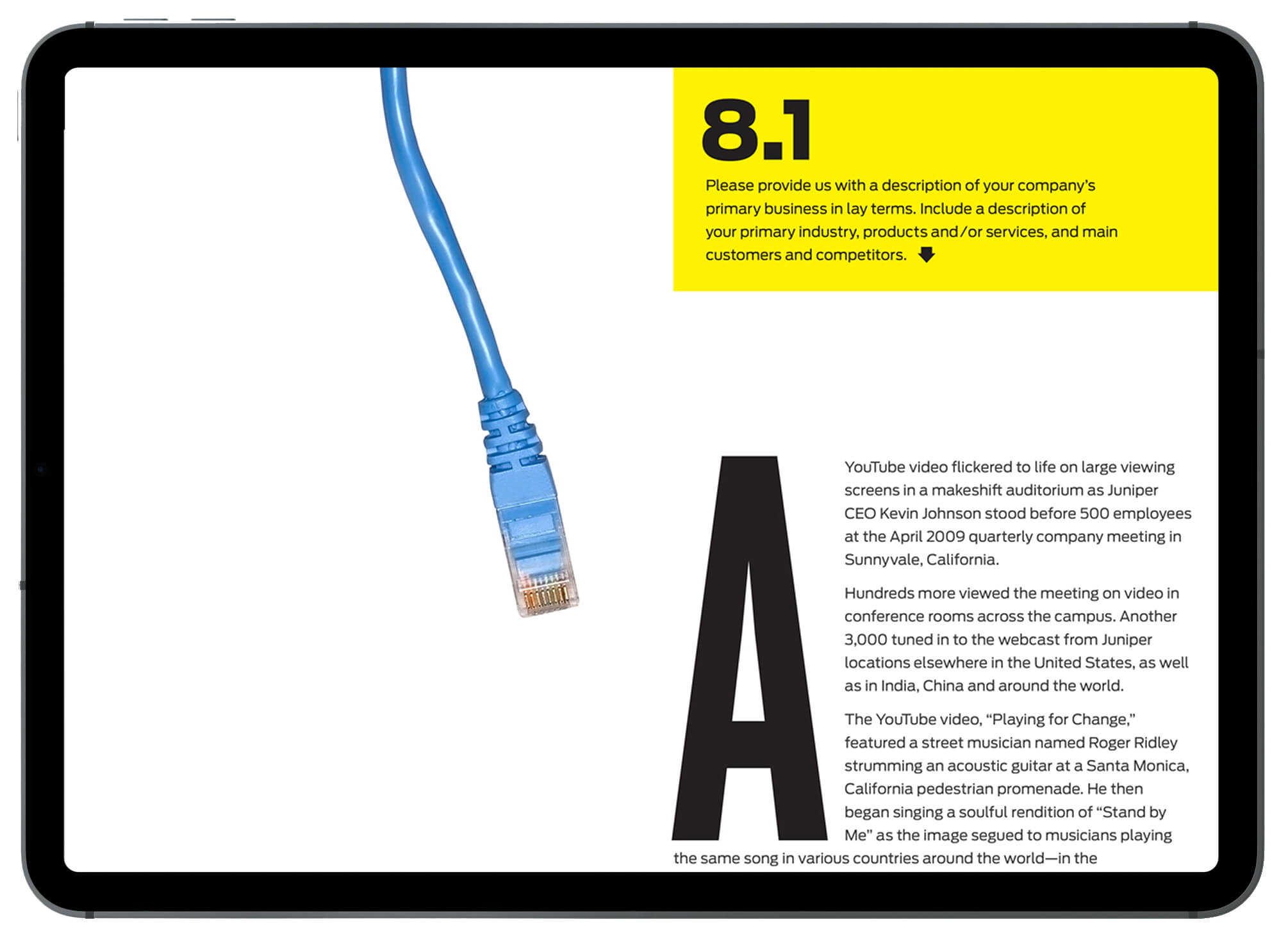
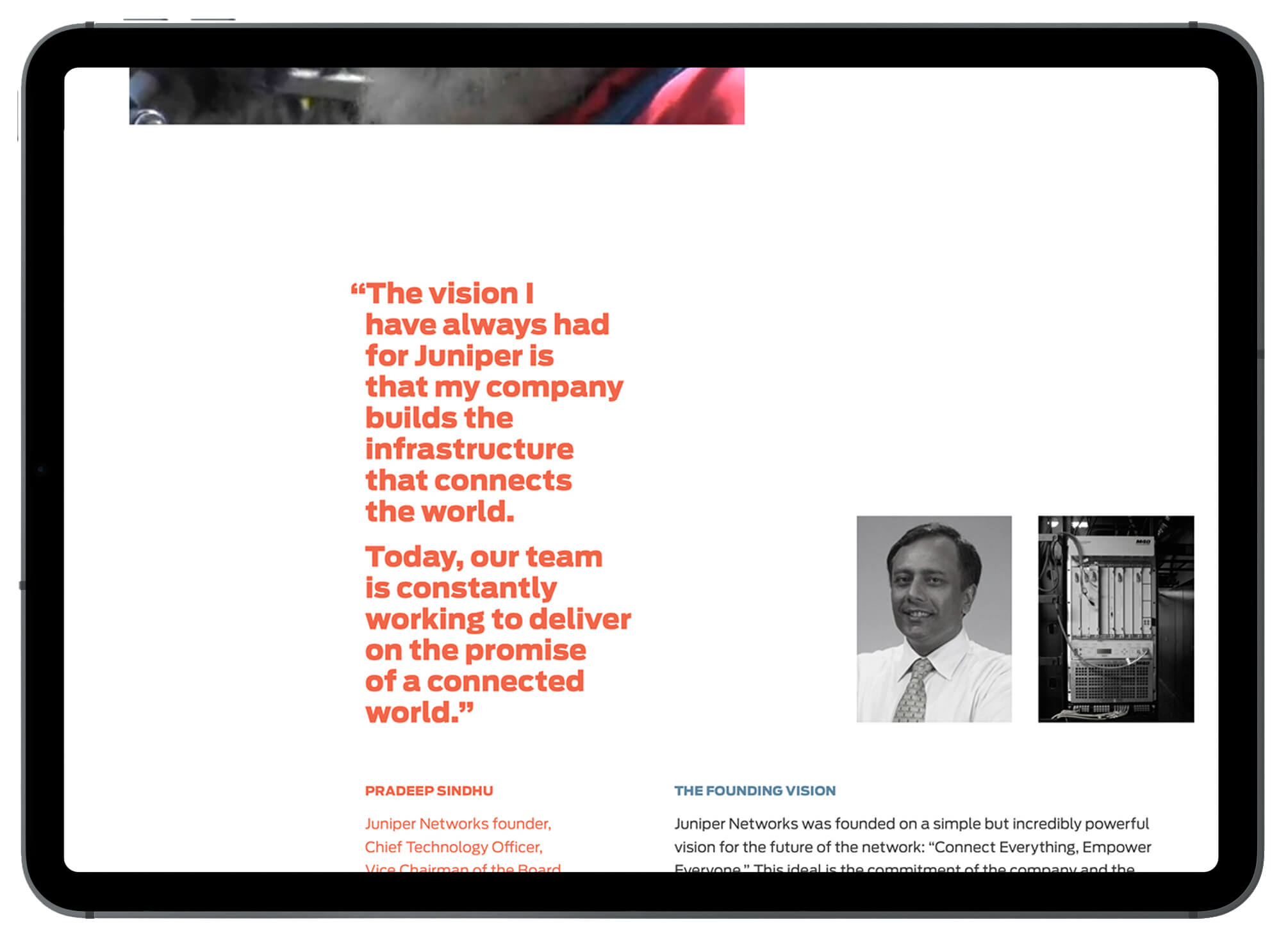
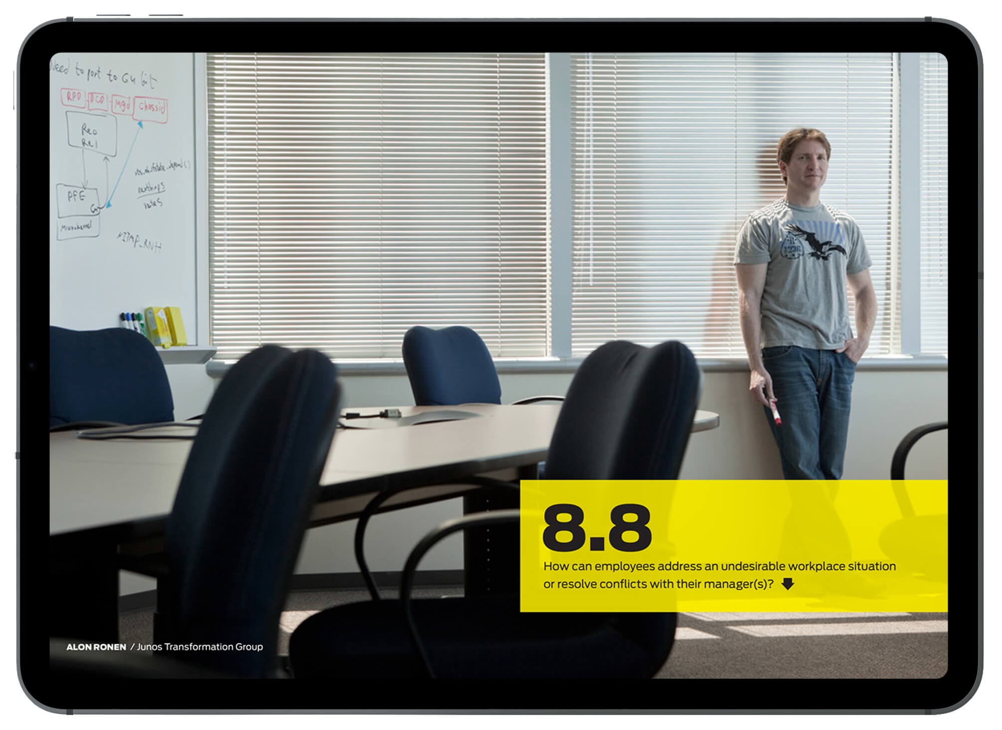
Employee engagement Juniper needed branding and a campaign to promote Mission 10: A new network for a new decade, a rallying cry and business plan rolled into one. Using their corporate font, Antenna, we altered the io of the word mission to look like a figure 10, and produced a series of posters that tried to get employees to “think beyond the cube” and be energized by Juniper’s impact on the wider world. We also delivered Juniper’s 2010 Best Places to Work submission as an iPad app, one of the first companies to do so.

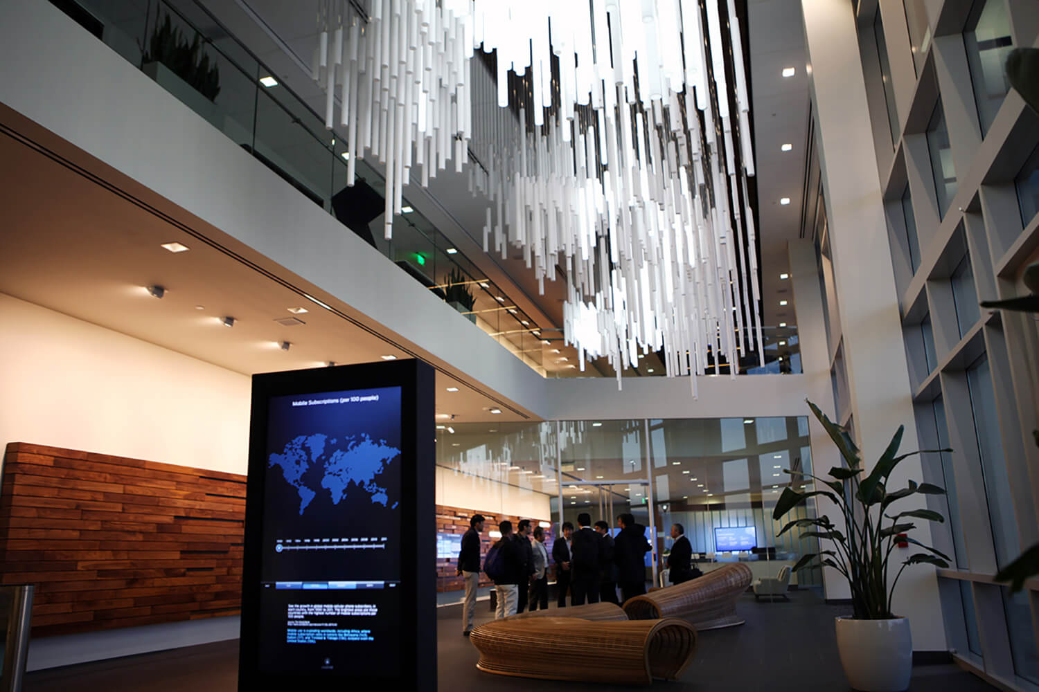
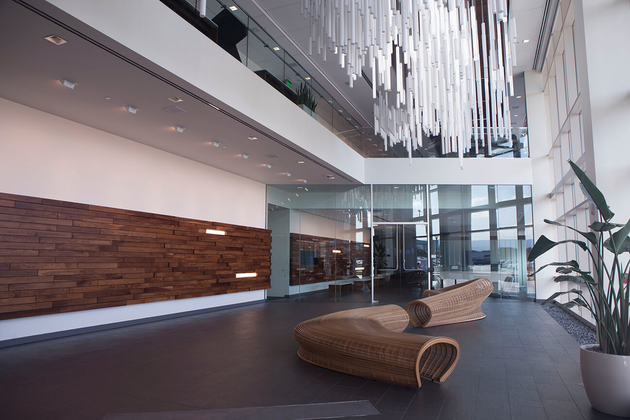
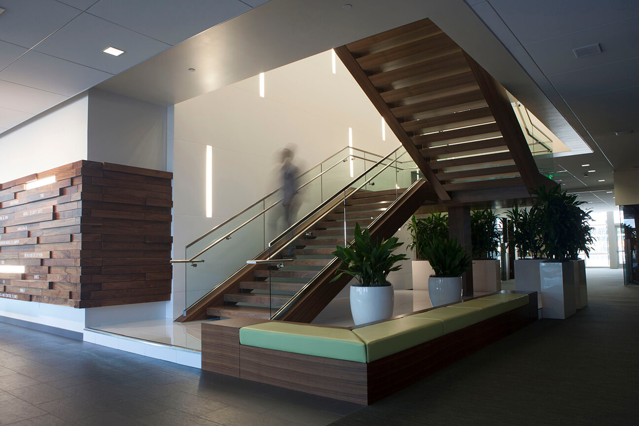
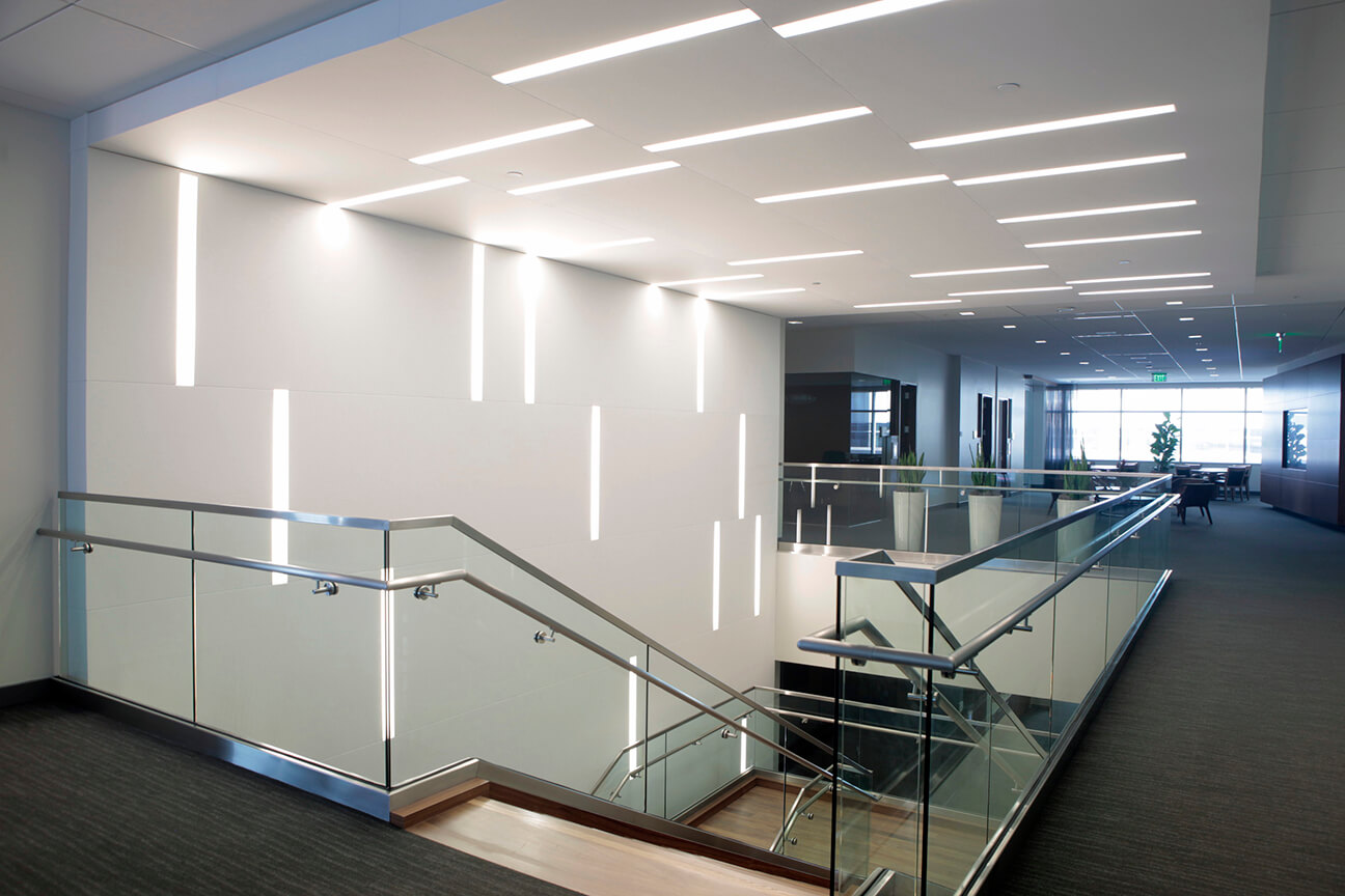
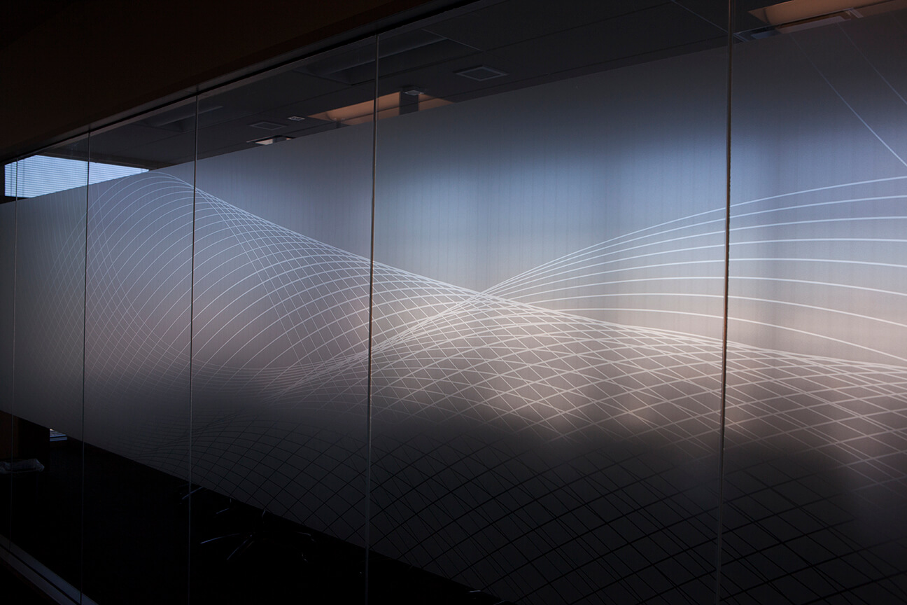
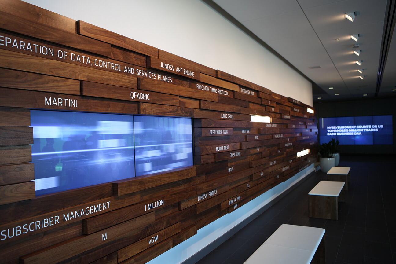
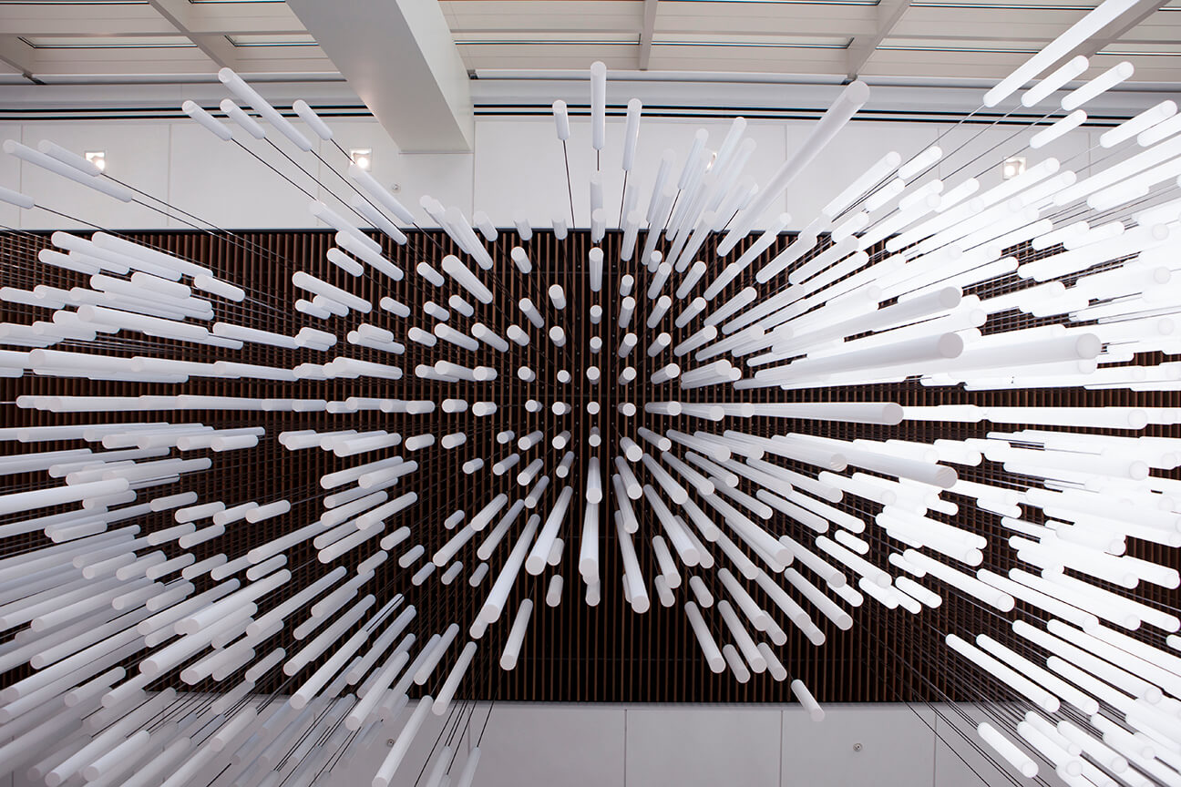
Environmental design Juniper Networks’ new Sunnyvale campus was a chance to turn their brand into a memorable experience. Inspired by the idea that environmental branding can be a strategic application of a brand in three-dimensional spaces, we created campus signage, seating, lighting and interactive sculptural installations that further immersed Juniper’s audience with their brand—as well as differentiated Juniper from their competitors.
